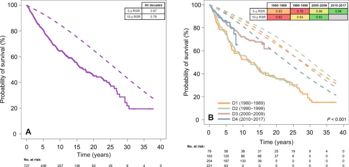
Fig. 3. Relative survival ratios (RSR, calculated by dividing observed by expected survival) are detailed in the built-in tables and color-coded within each row, red and green representing poorer and better RSR values, respectively.
a Comparison of observed (solid line) versus expected OS (dashed line) for the global series. b Comparison of observed (solid line) versus expected OS (dashed line) according to the decade of diagnosis. D decade, y year.

