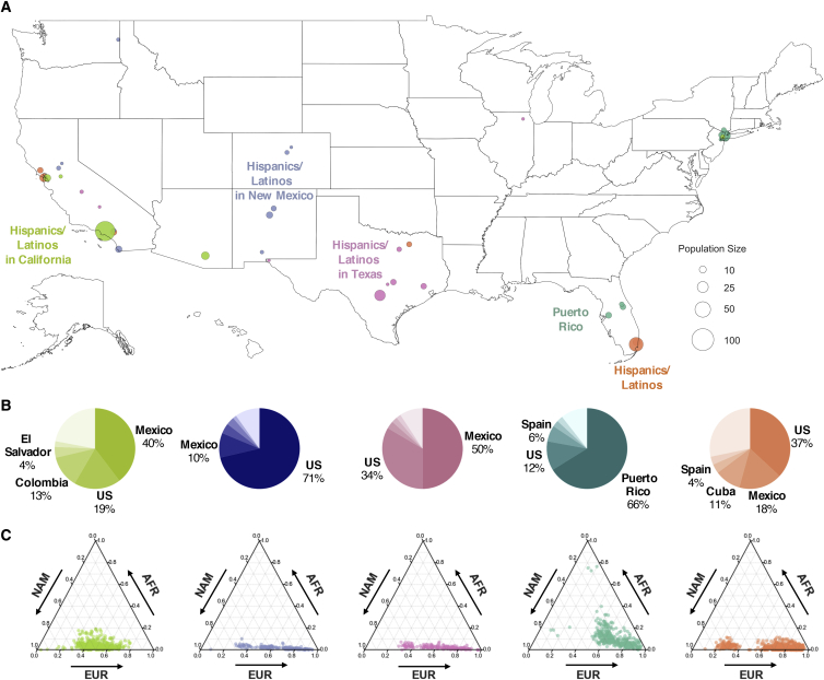
Figure 4.
Geographical Distribution of Hispanic/Latino Haplotype Clusters
(A) Each dot corresponds to a county containing present-day individuals and the size of the dot signifies the number of samples of the particular cluster in that county. Only the Hispanic/Latino cluster with the highest odds ratio is shown for each county, and for clarity, only the top ten locations with the highest odds ratio are shown for each cluster. Maps showing the full distribution for each haplotype cluster can be found in the supplement (Figure S15).
(B) Ancestral birth origin proportions of each cluster for individuals with complete pedigree annotations, up to grandparent level. Proportions were calculated from aggregating the birth locations of all grandparents corresponding to members of each haplotype cluster. For each chart, only the top five birth origins are shown as individual proportions; the remaining birth origins are aggregated into one slice (lightest color).
(C) Ternary plots of ancestry proportions based on local ancestry inference for each haplotype cluster. Each dot represents one individual.

