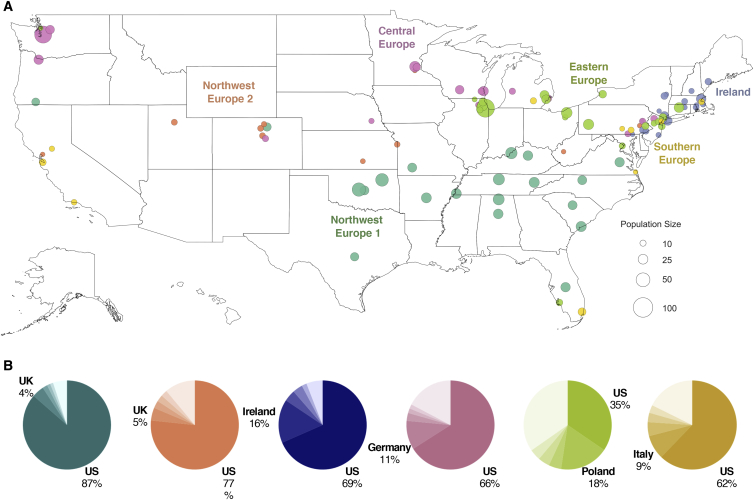
Figure 5.
Geographical Distribution of European American Haplotype Clusters
(A) Each dot represents a county containing present-day individuals. The size of the dot represents the number of individuals of the particular cluster in that county. For each cluster, the top 20 locations with the highest odds ratio are shown. Maps showing the full distribution for each cluster can be found in the supplement (Figure S16).
(B) Ancestral birth origin proportions for each cluster in (A). Only individuals with complete pedigree annotations, up to grandparent level, are included. For each chart, only the top five birth origins are shown as individual proportions; the remaining birth origins are aggregated into one slice (lightest color).

