. 2020 Feb 21;9:e53704. doi: 10.7554/eLife.53704

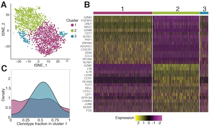
Figure 5. Phenotypic diversity of NS4B-specific cells 18 months after yellow fever immunization.

(A) 2D t-SNE visualization of unsupervised clustering (Seurat analysis) of RNAseq data based on 2000 most variable genes shows three distinct clusters of NS4B-specific cells. (B) The heatmap of top 15 significantly enriched genes of single cells in clusters 1 and 2 defined by the MAST algorithm. The panel above the heatmap identifies the cluster identity of the cells. (C) Gaussian kernel density estimate for the relative fraction of cells belonging to cluster one for each clonotype. Blue distribution shows the theoretical prediction under the null hypothesis: clonotype labels were shuffled between cells (1000 permutations). The observed distribution is flatter than the theoretical one, indicating the presence of clonotypes with either a minority or a majority of cells belonging to cluster 1 (χ2 -test with MC-estimated p-value=0.0005).

Figure 5—source data 1. Differentially expressed genes between NS4B-specific cells 18 months after vaccination.
Figure 5—source data 2. Differentially expressed genes between NS4B-specific clonotypes 18 months after vaccination.

Figure 5.

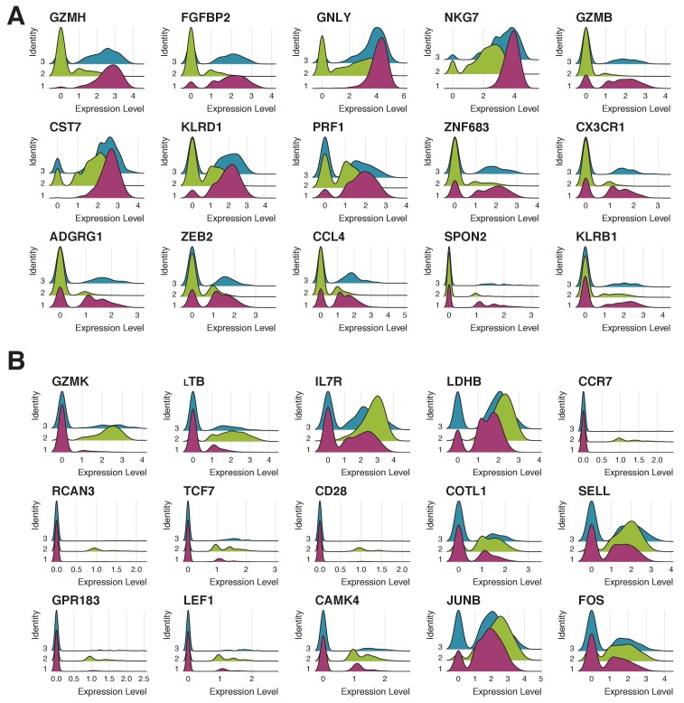
Figure 5—figure supplement 1. Expression patterns of 15 genes most characteristic of clusters 1 and 2.

Figure 5—figure supplement 1.

(A) Expression of 15 genes most characteristic of cluster one in cells corresponding to clusters 1 (pink), 2 (green) and 3 (blue). Cluster three has the intermediate phenotype. (B) Expression of 15 genes most characteristic of cluster two in cells corresponding to clusters 1 (pink), 2 (green) and 3 (blue). Cluster three has the intermediate phenotype.
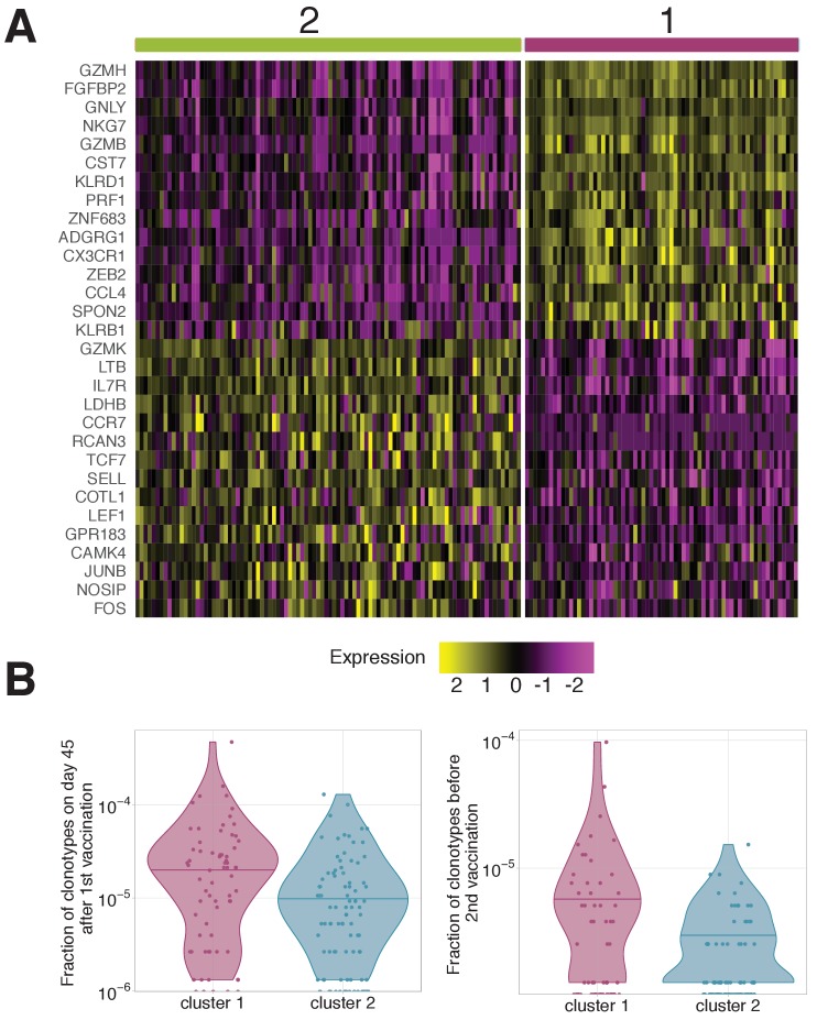
Figure 5—figure supplement 2. Gene expression patterns averaged by clonotypes.

Figure 5—figure supplement 2.

(A) Genes differentially expressed between clonotypes. Gene expression in each cell was averaged over the clonotypes before differential gene expression analysis. Unsupervised clustering shows two clusters with very similar gene expression to clusters 1 and 2 observed on scRNAseq of individual cells (Figure 5B). (B) Frequency of clonotypes corresponding to cluster 1 and 2, after primary immunization (left), and 18 months later before the booster vaccination (right). Clonotypes associated to cluster one are significantly more abundant on both these timepoints (Mann Whitney U-test A: p-value=0.0003; B: p-value=0.02447 ). .
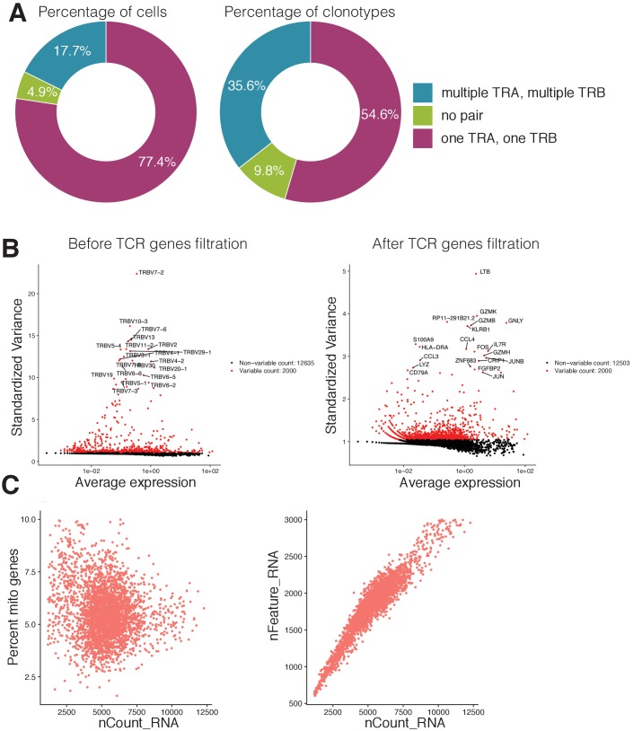
Figure 5—figure supplement 3. Single cell RNAseq and TCRseq quality control.

Figure 5—figure supplement 3.

(A) Proportion of cells (left) and clonotypes (right) in single-cell TCR sequencing data carrying different numbers of TCR alpha and TCR beta chains. (B) Most variable genes in the dataset before (left) and after (right) the filtration of TCR related genes. TCR related genes were the source of unwanted variation in single-cell gene expression analysis and were removed from the data. (C) Visualization of quality control metrics in the single-cell gene expression experiment. The relationship between the number of RNAs inside the cell (x-axis) and the percentage of mitochondrial genes (y-axis) is shown on the left. The relationship between the number of RNAs inside the cell (x-axis) and the number of genes (y-axis) is shown on the right. Cells that had more than 8% of mitochondrial genes or more than 2700 total number of genes were discarded from further analysis. .