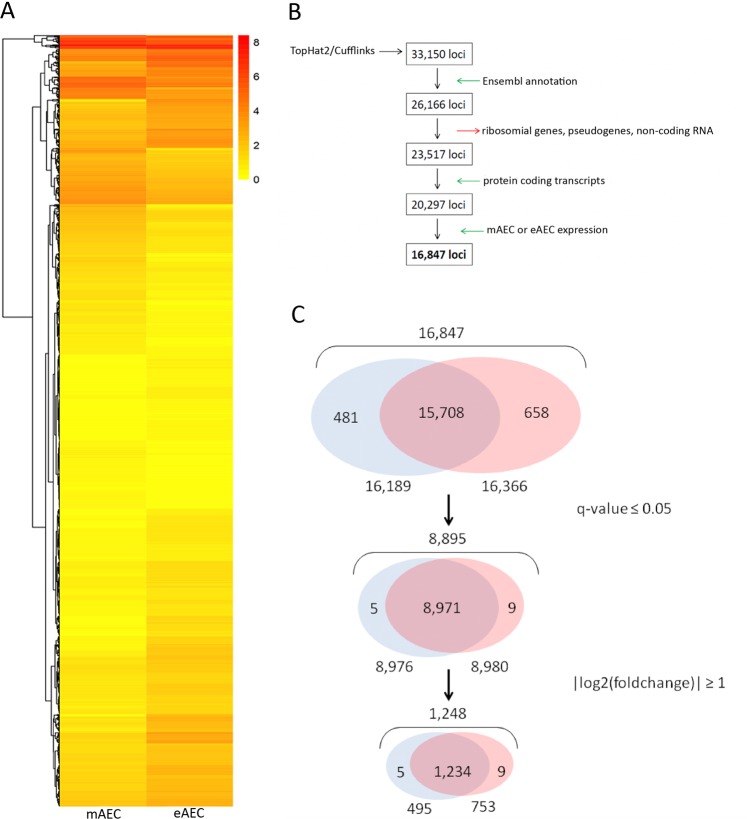
Figure 2.
Bioinformatics steps. (A) Heatmap analysis shows differences in gene expression between the mAEC and eAEC. Each column represents a cell population and each row represents a gene. The expression levels, based on FPKM expression values, are visualized using a gradient color scheme. (B) The flowchart summarizes the procedure performed to identify the study dataset (16,847 loci) using TopHat2/Cufflinks pipeline (detailed information on filtering procedure can be found in Supplementary File S1). The boxes represent the subsequent output data returned from individual filtering steps (green and red arrows) starting from RNA-seq raw data (33,150 loci). (C) The Venn diagrams show the characteristic DEGs number identified in both AEC populations after q-value ≤ 0.05 and |log2(foldchange)| ≥ 1 filtering steps. The figure not only displays the number of overlapped genes between the two cell populations but highlights the genes expressed exclusively in one of them.

