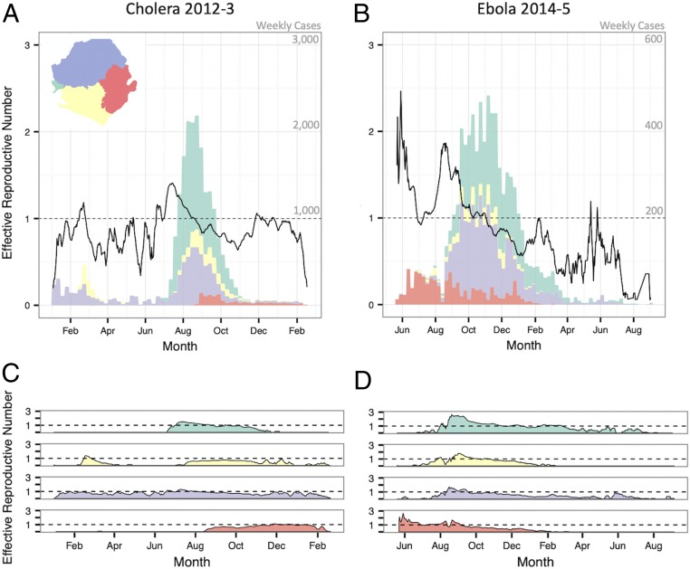
Fig. 3.
Weekly case counts show outbreak trajectory in the four regions of the country. The bars in A and B indicate the weekly case count on independent y axes of cholera and Ebola, respectively. Black lines show maximum likelihood estimates of Rt of cholera and Ebola epidemics nationally (A and B, respectively) and in each region (C and D, respectively).

