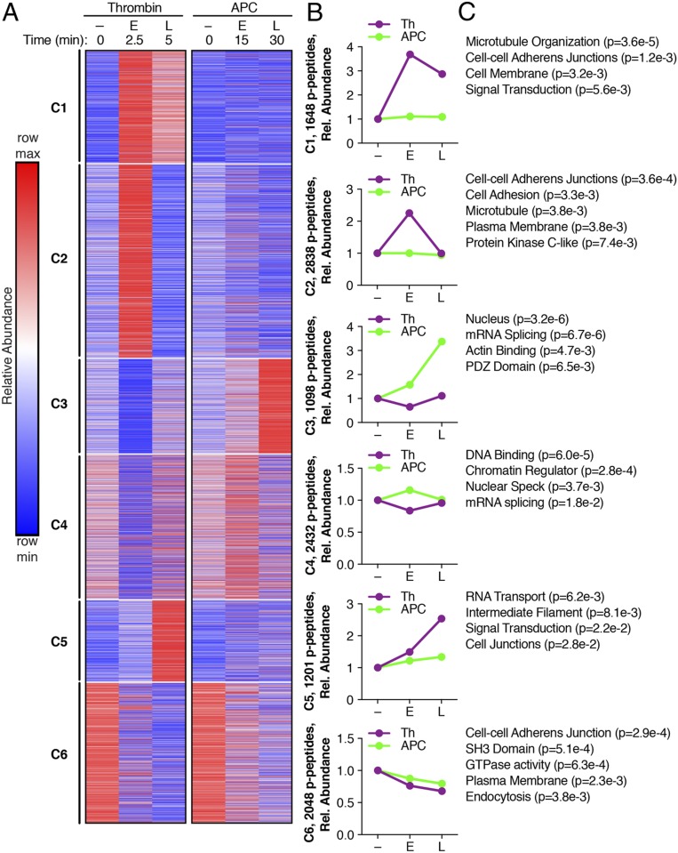
Fig. 2.
A k-means clustered heat map of the 11,266 quantified phosphopeptides (p-peptides) from Th and APC treatments (A) separated into six clusters. Increases and decreases in phosphorylation are represented by the red and blue colors, respectively. Color intensities depict phosphopeptide levels in each sample induced by Th or APC normalized to their respective 0 min control and relative (rel.) to the maximum and minimum abundances per row. (B) Th- and APC-induced changes in phosphopeptide abundance plotted against early (E) and late (L) times; – indicates 0 min non-treated. (C) Gene ontology enrichment analysis and rank based on statistical significance; P values were determined by Student’s t test.

