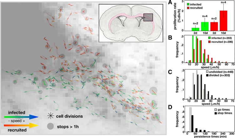
Fig 3. Data from the rat experiment.
Left: Single cell trajectories at 2 days post infection overlaid on the cell density map. The insert shows the region of interest within the rat brain where the pink highlights the white matter. An asterisk marks where a cell division occurred. Each track contains an arrow for the first and last half of the track showing the average direction and speed over that time period. The arrows for the infected cells are green for lower speeds and blue for higher speeds. The arrows for recruited cells are red for lower speeds and yellow for higher speeds. Gray dots mark where a cell has stopped longer than 1 hour with the size proportional to the stop time. Right: Metrics derived from data. A) Proliferation rates (in % divisions per hour) at day 2 and 10 for infected and recruited cells (for n trials indicated). Speed distributions (calculated as distance traveled over time travelling in μm/h) for B) infected vs recruited cells (mean speeds: 21.7μm/h vs. 25.0μm/h, respectively) and for C) undivided vs divided (mean speeds: 25.3μm/h vs. 22.1μm/h, respectively). D) Time spent during periods of movement or stopping for all cells (42.6min vs. 70.1min, respectively).

