
Fig. 4. Dots depict increase in CO concentration associated with light exposure for each individual in the second study.
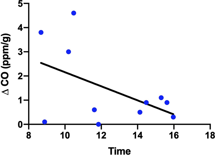
The line depicts a “best-fit” curve from linear regression.
Official websites use .gov
A
.gov website belongs to an official
government organization in the United States.
Secure .gov websites use HTTPS
A lock (
) or https:// means you've safely
connected to the .gov website. Share sensitive
information only on official, secure websites.
The line depicts a “best-fit” curve from linear regression.