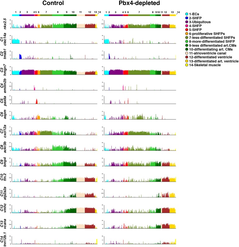
Fig. 10.
Gene expression within each cluster. Bar chart comparisons of gene expression in individual cells for genes found to be enriched in each cellHarmony assigned cluster. Each of the ∼2900 and ∼2400 cells from control and Pbx4-depleted embryos, respectively, is represented by a line on the x-axis of the graph. Y-axis indicates fold difference (log2) for the expression of each gene within a cell.

