
Fig. 2.
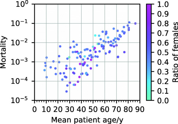
Scatter plot of mortality versus mean age in the different clusters with colours indicating the sex distribution in the corresponding cluster
Official websites use .gov
A
.gov website belongs to an official
government organization in the United States.
Secure .gov websites use HTTPS
A lock (
) or https:// means you've safely
connected to the .gov website. Share sensitive
information only on official, secure websites.
Scatter plot of mortality versus mean age in the different clusters with colours indicating the sex distribution in the corresponding cluster