Figure 4.

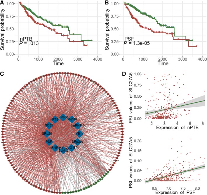
Correlation analysis between splicing factors and splicing events. A‐B, Kaplan‐Meier curves showed the correlations between the expression of the splicing factors, PSF and nPTB, with OS. C, Network of splicing factors and splicing events. Blue nodes indicated splicing factors, green nodes represent down‐regulated OS‐associated splicing events, red nodes indicate up‐regulated OS‐associated splicing events, red lines indicate positive correlations, and gray lines indicate negative correlations. D, Dot plot of correlations showing the association between the expression of nPTB and SLC27A5 PSI values, and the association between the expression of PSF and SLC27A5 PSI value
