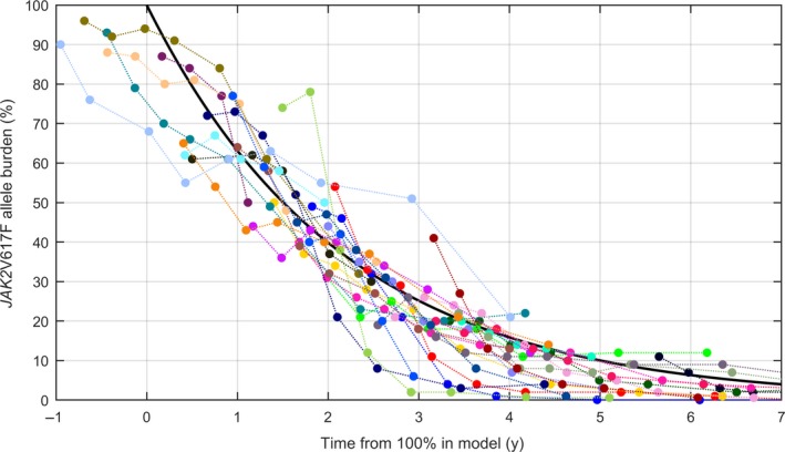
Figure 3.

Population‐level decay rate. The population‐level decay rate of the mono‐exponential model is shown in black, with data for the 29 patients with the best goodness‐of‐fits. Note that data were shifted in time such that the mean of the JAK2V617F allele burden coincides with the main curve at the mean day of measurement
