FIGURE 8.

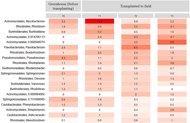
Heatmap showing the relative abundance of the 20 most abundant rhizosphere bacterial taxa at the genus level across all samples from the transplantation experiment. T0 = greenhouse plants before transplanting to field, T1 = 3 months after transplanting, T2 = 6 months after transplanting and T3 = 9 months after transplanting. Numbers represent the bacterial relative abundance percentages, and the darker shades of red in the figure represent the higher percentages of relative abundance at the bacterial genus level, whereas the lighter colors represent the lowest relative abundance at bacterial genus level per sample.
