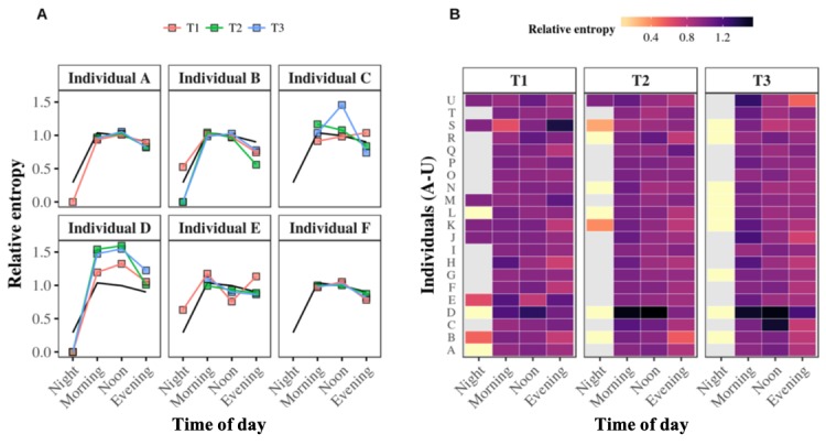
Figure 5.

Relative entropy values at the individual level. Panel A. The relative entropy values of the same 6 individuals described in <xref rid="figure2" ref-type="fig">Figure 2</xref> for the night, morning, afternoon, and evening are calculated for the first, second, and third 4-month periods: T1 (red curve), T2 (green curve), and T3 (blue curve), respectively. The black curve represents the whole population’s average relative entropy value over the three periods. Panel B. The heat map summarizes all the relative entropy values of all 21 egos. The lower or higher the relative entropy, the brighter or darker the color assigned to it, respectively. Missing values are assigned a grey color.
