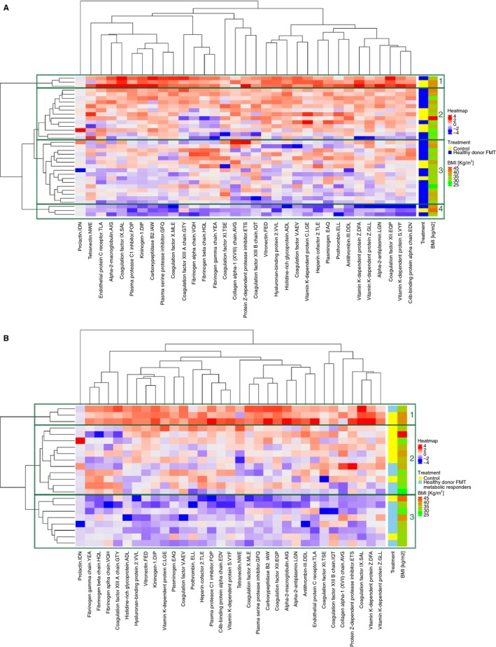
Figure 3.

Coagulation proteome heatmaps and hierarchal clustering of subjects with different treatment and metabolic responder status. Proteins are represented as difference in abundance between baseline and 6 weeks after fecal microbiota transplant (FMT). The differential protein abundance is represented in z‐scores and displayed in continuous color levels ranging from − 4 in blue to + 4 in red. A, Healthy donor FMT versus control. The hierarchal clustering can be split with a high‐level cut into four major subtrees indicated as boxes and numbered from 1 to 4. Subtrees 2 and 3 dominate the middle part with 29 subjects. B, Healthy donor FMT metabolic responders versus control. The hierarchal clustering can be split with a high‐level cut into three major subtrees indicated as boxes and numbered from 1 to 3. Subtrees 2 and 3 dominate with 19 subjects
