
Figure 1.
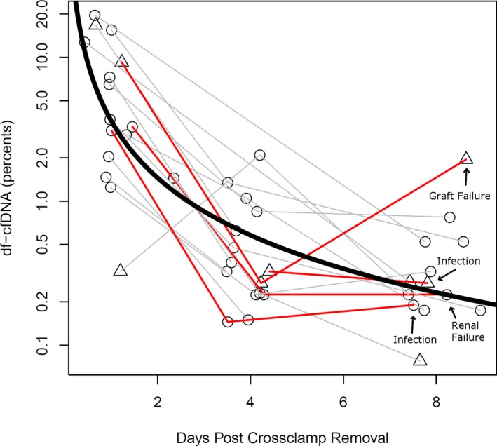
DF cfDNA measured at time points immediately after transplant. Time points are calculated to the minute when available and correspond to targeted post‐transplant days 1, 4, and 8. Circles indicate samples drawn without indication of infection, triangles indicate active treatment for infection. Gray lines (n = 13) indicate trajectories of patients surviving the first year, and red lines indicate those who died (n = 4). Thick black curve is a linear trend line averaging all data points (normal decline)