. 2020 Mar 11;9:e50240. doi: 10.7554/eLife.50240

Figure 6. Frailty-associated markers have shared positive associations across multiple diseases in both age groups and have a specific metabolic signature.

(A) Actual FIM values versus FIMs predicted by Random forest of microbiome features of the elderly individuals of the ELDERMET cohort living in Community or Residential care (Longstay). (B) Mean ranks of the various taxonomic groups (identified in Figure 3) for the prediction of FIM (an inverse measure of frailty) in the ELDERMET cohort. (C) Variable Importance Scores of the eight markers with the highest predictive power in the Random Forest models for prediction of FIM. A comparison of the abundance of markers between HighFIM and LowFIM individuals indicated that all of these markers were associated with frailty state. (D) The network in the central panel indicates the 13 metabolite profiles significantly associated with the top markers. Taxon markers are indicated in the center. Consumption profiles are in the upper half (in pink octagons) and Production profiles are on the lower panel (in yellow octagons). Edges indicate presence. Second from the left in top panel are the correlations between predicted and actual FIM values obtained for iterative bootstrapped Random Forest models (training on 20% and testing on the rest 80%) using only the 13 metabolite profile markers of (D), all metabolite profiles and all metabolite profiles removing the 13 metabolite markers. Top and bottom panels show the validation (indicated by arrows) obtained for the predicted metabolite markers using either the measured metabolites, dietary consumption profiles, specific microbial pathway abundances as well as the CutC gene family abundances identified using humann2 (shown either as boxplot comparing the profiles between Frail and Non-Frail individuals or scatterplots showing correlations between the measured metabolite level and the FIM value of the individuals). A total of 11 of the 13 metabolites could be validated using either of these strategies.

Figure 6—source data 1. Top 17 predictive features for (A) FIM and (B) Barthel Score in the ELDERMET cohort.
The direction of association is obtained by performing a wilcox test of the abundance of each feature in the Low Frailty (HighFIM or HighBarthel) and the High Frailty (LowFIM or Low Barthel) individuals. −1 indicates increase with frailty and +1 indicates decrease with frailty. For each measure, the association of the measure with respect to the abundance of each marker species after taking into account the medication type (computed using Envfit) is also shown, indicating that the association of the markers with either of the measures is significant even after taking account the medication. (C) Top 15 markers of FIM prediction in the Elderly individuals with High Medication Usage and Low Medication Usage. The top markers for Frailty predictions across the entire dataset are highlighted in Green.
Figure 6—source data 2. Predicted metabolite map of species in this study based on combined pathway-taxon associations from Noronha et al. (2018) and Sung et al. (2017).
elife-50240-fig6-data2.xlsx (972.4KB, xlsx)

Figure 6.

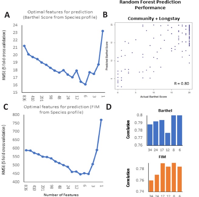
Figure 6—figure supplement 1. Frailty-prediction using Random Forest models and the identification of the topfrailty-predictive taxonomic features.

Figure 6—figure supplement 1.

(A) Log Root Mean Squared Error of Random Forest prediction of Barthel Score (with five-fold cross validation) from microbiome species profile (obtained with different number of species arranged in decreasing order of their variable importance scores) (B) Scatterplot showing correlation between the Random Forest predicted Barthel and actual Barthel for Community + Longstay (C). Log Root Mean Squared Error of Random Forest prediction of FIM (with five-fold cross validation) from microbiome species profile (obtained with different number of species arranged in decreasing order of their variable importance scores). (D) Correlation values between Barthel Score and FIM and different number of top features.
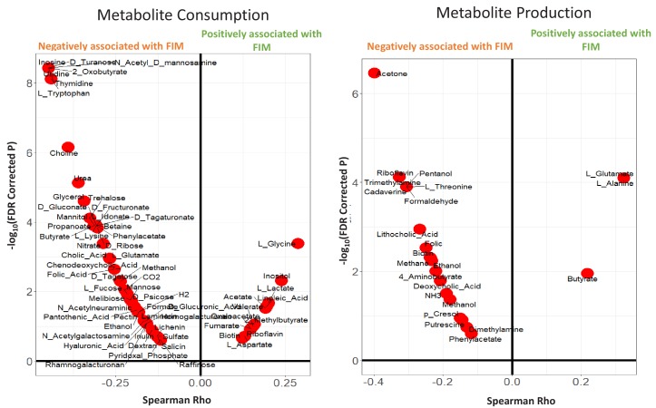
Figure 6—figure supplement 2. Violin plots showing the Metabolite consumption and production profiles that were significantly associated with FIM scores (with Spearman Rho FDR < 0.25).

Figure 6—figure supplement 2.

The X axis shows the Spearman rhos and the Y-axis shows the -Log of FDR (with base 10).
Figure 6—figure supplement 3. Heatmap based representation of the metabolic signatures associated with taxa gain/loss groups defined in main text Figure 4C: (A) G1-G3 (B) L1-L3.

Figure 6—figure supplement 3.