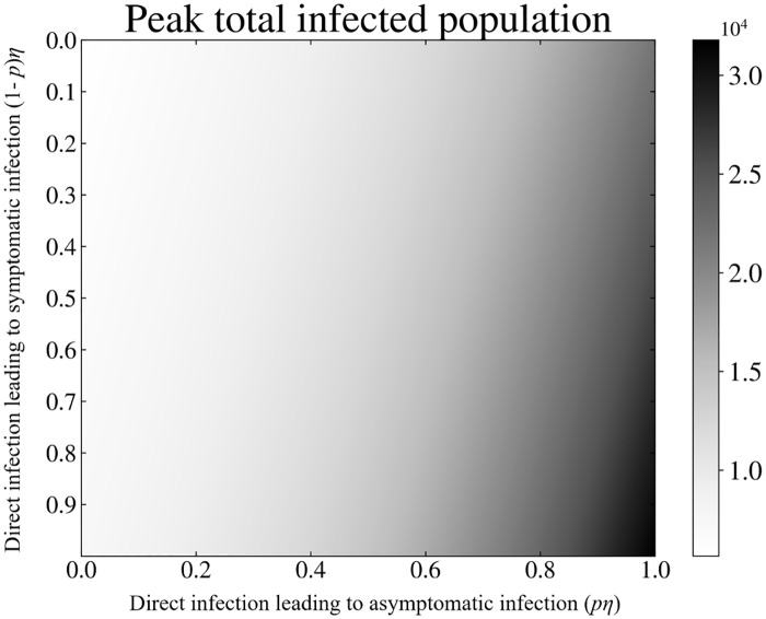
Fig 4. Peak infected population behavior: A heat map of peak total infected population as a function of household (direct) transmission terms (1 − p)η and pη.
Along the X and Y axis, the household transmission terms are notated as multiples of their nominal model values as seen in Table 1. The top left corner denotes the region where pη = (1 − p)η = 0, and no household transmission occurs. While the bottom right corner denotes the region where η = nominal model value. The gray-scale intensity within the heat map represents the peak total infected population. Comparing the intensity of the top left corner to the bottom right we see an increase in the peak total infected population as household transmission is introduced and its effects increased.

