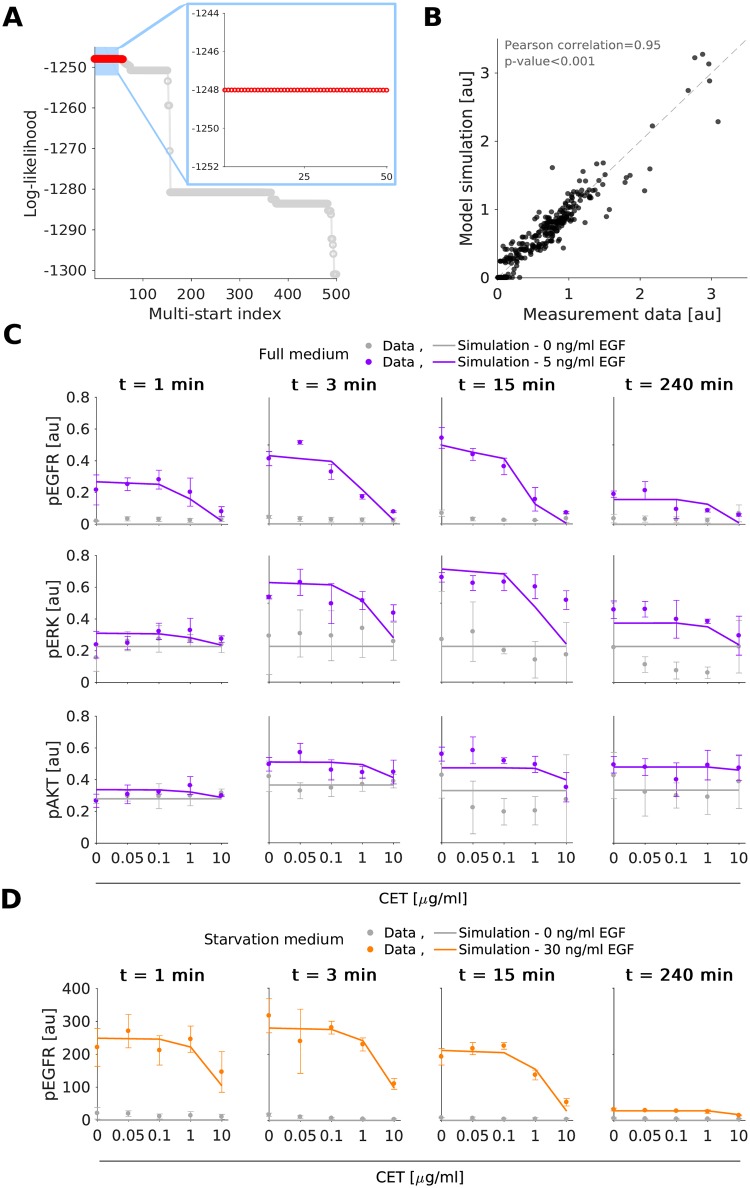
Fig 2. Experimental data and model fit for the gastric cancer cell line MKN1.
A: Waterfall plot for multi-start local optimization. The best 500 out of 1000 runs are depicted from which a magnification of the best 50 multi-starts is indicated by the blue box. Red dots denote the starts converged to the global optimum within a small numerical margin. B: Scatter plot for the overall agreement of experimental data and model fit. C-D: Comparison of selected experimental data and model fits. Time and dose response data obtained using immunoblotting indicate the mean and standard deviation of three biological experiments. For visualization in C and D, experimental measurements were scaled to model simulation using the estimated scaling factors to overlay the response to different experimental conditions. Additional data and model fits are provided in S3 Fig and S1 Text, Section 2.

