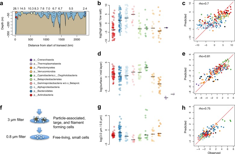
Fig. 3. Observed and predicted distributions of BACLs along selected niche gradients.
a Side view of Transect 2014 with surface and mid layer samples indicated by circles, colored according to salinity as in Fig. 1. Numbers above the graph indicate salinity in the surface layer samples. b Ratio between abundance in the high and low salinity surface samples of the Transect 2014 cruise. Values are log ratios of the mean abundances in the 14.5 and 28 PSU and the 2.4 and 5.5 PSU samples. Distributions are plotted separately for each taxon, with median values indicated by horizontal lines. c Machine learning predicted vs. observed log ratio between abundance in the high and low salinity samples. d Ratio between abundance in surface and abundance in mid layer water samples from the Transect 2014 cruise. Values are average log ratios for the 10 surface/mid sample pairs. e Machine learning predicted vs. observed log ratio between abundance in surface and mid layer samples. f Cartoon indicating difference between cells captured on 3 and 0.8 μm filters by sequential filtration. g Ratio between abundance on 3.0 μm and abundance on 0.8 μm filters in the Askö Time Series 2011 sample set. Values are average log ratios for the six 3.0 μm/0.8 μm sample pairs. h Machine learning predicted vs. observed log ratio between abundance on 3.0 and 0.8 μm filters. Machine learning predictions performed by gradient boosting using gene (eggNOG) profiles. Low abundance BACLs were excluded from the graphs in b, d, g (see Methods).

