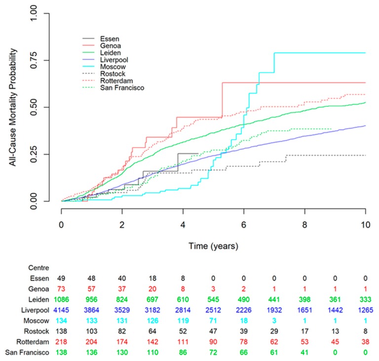
Figure 1.
Kaplan–Meier estimates of all-cause mortality for the centers involved in the study. The Liverpool development dataset is shown in solid blue line for comparison. The figure shows that datasets from Essen and San Francisco had the closest match to the Liverpool dataset. The numbers below the figure are the number of subjects at risk entering the corresponding time point for each dataset.

