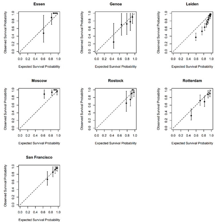
Figure 2.
Calibration graphs comparing observed and predicted survival in each of the external datasets at 3 years post-treatment. Subjects were divided into five distinct prognostic groups according to their predicted survival and the average predicted survival for each group was plotted against observed survival. The dashed diagonal line is the line of equality and so markers along this line show perfect agreement between their predicted and observed survival.

