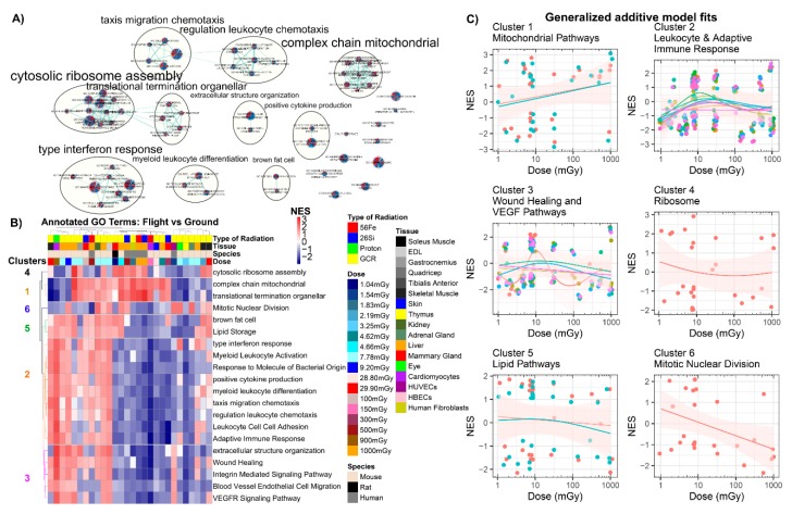
Figure 5.
Analysis of all GeneLab datasets utilized for direct comparisons with Gene Ontology (GO) GSEA analysis. (A) Auto-annotated GO GSEA terms from Cytoscape’s enrichment mapper. Each node represents one specific GO term with each wedge representing one GeneLab datasets utilized for this manuscript. The yellow circles represent the auto-annotated go terms with common related pathways. (B) Heatmap with k-means clustering for the specific GO pathways. Six specific pathways were found to be clustered together through k-means clustering. (C) Scatter plots comparing the normalized enrichment scores (NES) to dose in milligrays and fitting with a generalized additive model (GAM) on each cluster (represented in (C)). Each panel represents one of the clusters and the color-coded lines represent GAM fits performed on each GO-annotated term in the cluster. The circles in the plots represent the gene sets and the pink shade around the GAM fits represent the standard error.

