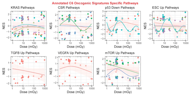
Figure 8.
Analysis of all GeneLab datasets utilized for direct comparisons with the GSEA C6 oncology signature collection analysis. Scatter plots comparing the normalized enrichment scores (NES) to dose in milligrays and fits with a generalized additive model (GAM) on specific C6 oncogenes. Each panel represents one specific oncogene and the color-coded lines represent GAM fits performed on the multiple C6 pathways associated with that oncogene. The circles in the plots represent the gene sets and the pink shade around the GAM fits represent the standard error.

