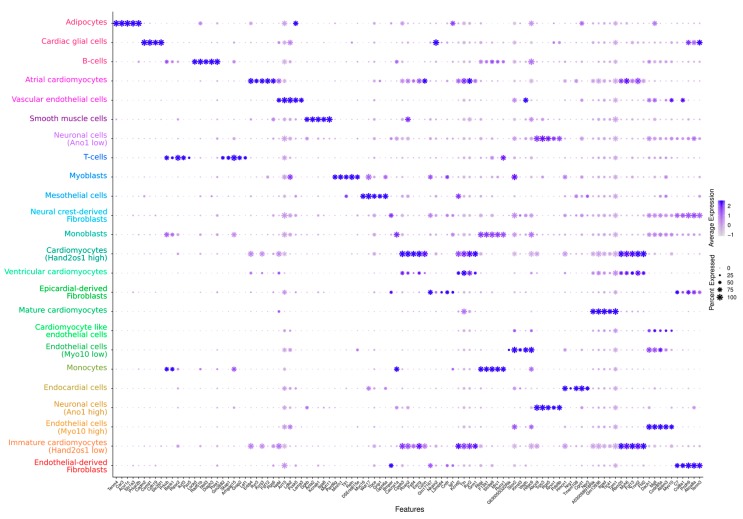
Figure 2.
Dot-plot representation of the gene expression marker genes for the identified cell types. The size of dots represents the relative gene expression in percent for each cluster, e.g., a value of 100 means that each cell within this cell type expressed this gene. The color indicates the average expression level for the indicated gene per cell type. The color of the clusters is taken from Figure 1. A dot plot for the most significant gene per cluster as well as an extended visualization of the top 10 markers per cluster can be obtained at our FairdomHub/iRhythmics instance.

