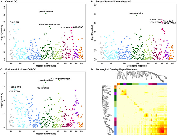
Figure 3: METhattan plots.
Manhattan plots of metabolites by metabolite groups, with each group being shown in a different color. A Overall ovarian cancer. B Serous/poorly differentiated ovarian cancer. C Endometrioid/clear cell ovarian cancer. D Topological Overlap Matrix (TOM). Metabolites in the rows and columns are sorted by the clustering tree. Light yellow shades represent low topological overlap (low similarity). Darker red shades represent higher overlap and similarity. Metabolite modules correspond to the squares along the diagonal.

