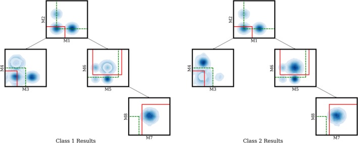
Figure 2.

Learning gate locations for simulated data: Green dashed lines show the initialization of gate locations before learning, while solid red lines represent the learned gates after convergence. . The two contour plots shown above are generated by applying kernel density estimation to the pooled data for each respective class. Deeper blue corresponds to higher data density at that region. For class 1, the M3 vs M4 leaf has more data in the bottom left corner. For class 2, the M7 vs M8 leaf has more data overall. Our proposed method successfully locates these two regions, which differ between the two classes starting from the heuristic initialization discussed in 2.1. (The M7 vs M8 leaf gate initialization has no data in it because the plot shows the data at each node filtered by its parents gates. Using the initial instead of final gates to filter the data, there is data in the M7, M8 heuristic initialized gate.) [Color figure can be viewed at http://wileyonlinelibrary.com]
