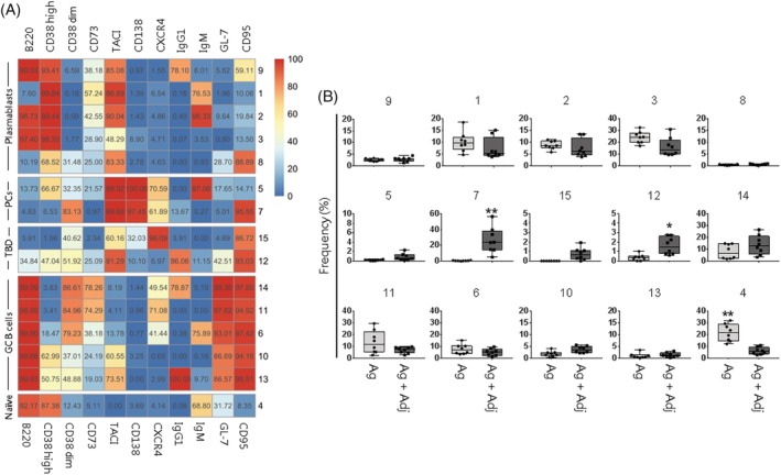
Figure 2.

FlowSOM analysis and metacluster frequency in mice immunized with adjuvanted or non‐adjuvanted vaccines. (A) Fifteen metaclusters from FlowSOM analysis were visualized as heatmap. Each row represents a different metacluster, while columns represent analyzed markers. The percentage of cells expressing a marker within a metacluster is reported and visualized with a color scale from blue (0%) to red (100%). B cell populations were indicated on the left (PCs, plasma cells; TBD, to be defined; GC, germinal center). (B) Box and whiskers plots showing the percentage of metaclusters in mice primed with antigen alone (Ag) or antigen and adjuvant (Ag + Adj). Values from individual animals were reported as circles. Mann–Whitney test corrected for multiple test (Benjamini‐Hochberg method) was used for assessing statistical differences between groups (*FDR < 0.05 or **FDR < 0.01). Only metaclusters that were significant (FDR < 0.05) in >50% of bootstrapping analysis were shown as significant. [Color figure can be viewed at https://wileyonlinelibrary.com]
