
Figure 1.
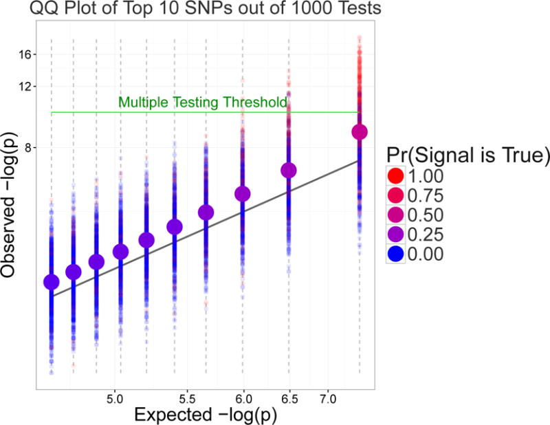
An average QQ plot over 1000 genetic associations studies. Smaller points represent top 10 P-values (on a logarithmic scale) from a given study. Larger points are averages of smaller points. The color of larger points highlights the empirical probability that the i-th ordered P-value, i = 1, …, 10, is a genuine signal.