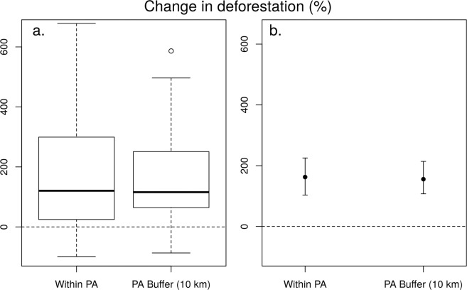
Figure 1.
(a) Box-and-whisker plot of change in deforestation (%) before and after the peace agreement, for protected areas and corresponding buffer zones (10 km); n = 39. The box indicates the lower and upper quartile of data distribution; bold horizontal lines represent the median. The ‘cat’s whiskers’ (vertical dashed line) indicates the highest and lowest values of the distribution, excluding outliers (circles). (b) Confidence intervals (95%), based on ranks (straight vertical lines). Black circles represent the pseudomedian values from the Wilcoxon test.

