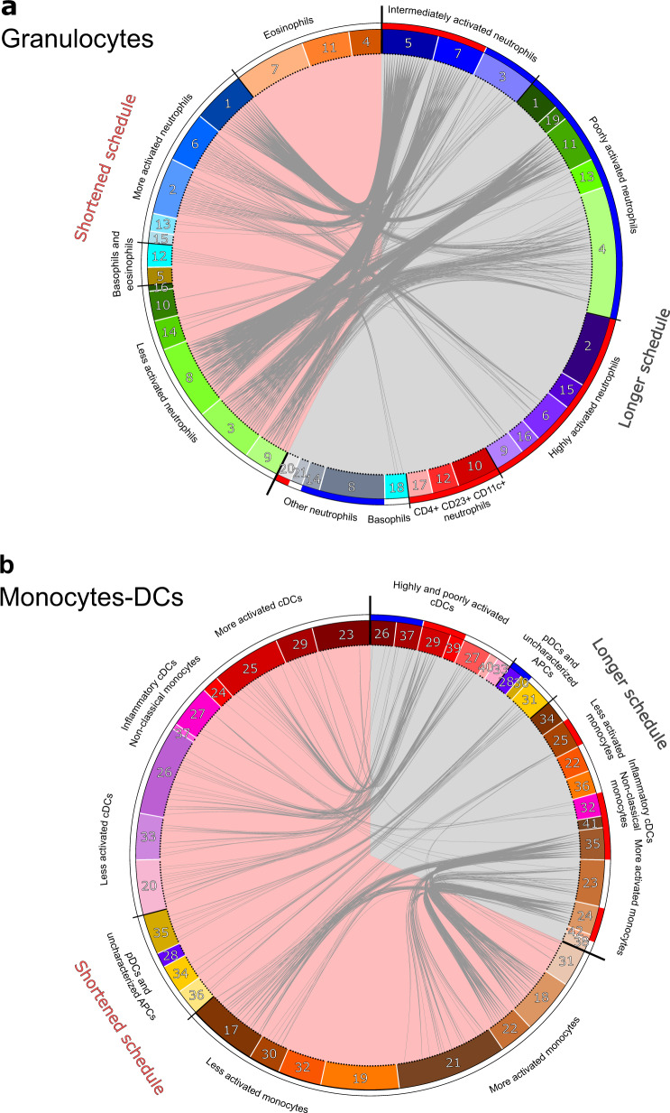
Fig. 6. Comparisons of cell cluster phenotypes identified in the two vaccine schedules.
The phenotype of each cluster of (a) granulocytes and (b) monocytes-DCs of the current shortened vaccine schedule study (left, pink background) was compared to that of clusters identified in the previous longer vaccine schedule study (right, gray background)15. The similarity between clusters was computed as the Manhattan distance, calculated for all the categories of expression of the 27 markers shared in both experiments. Clusters were considered to be similar if the in-between distance was strictly below 10 and they were linked together in the circular graph. For the shortened vaccine schedule dataset, the color code for the phenotypic families is identical for the circular graph (Fig. 6) and heatmaps (Fig. 4), whereas it has been modified for the previously published longer vaccine schedule15 to match identical annotations in both datasets. Phenotypic family annotations are displayed. For the longer vaccine schedule dataset, phenotypic families that were selected using the LASSO-LDA approach to distinguish prime and boost responses15 are represented with a blue (prime) or red (boost) color band.

