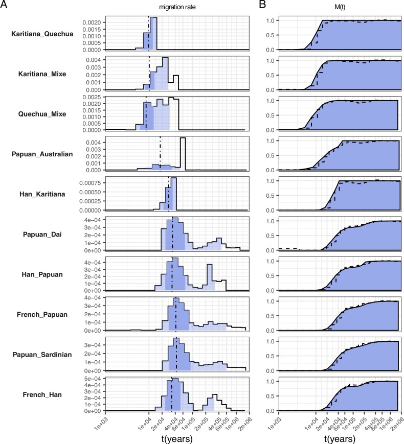
Fig 6. Selected migration profiles within non-African populations.
(A) Migration rates. Dashed lines indicate the time point where 50% of ancestry has merged, and shading indicates the 1%, 25%, 75% and 99% percentiles of the cumulative migration probability (see panel B). (B) Cumulative migration probabilities M(t). Dashed lines indicate the relative cross coalescence rate obtained from MSMC2. See S4 Fig for the full set of figures.

