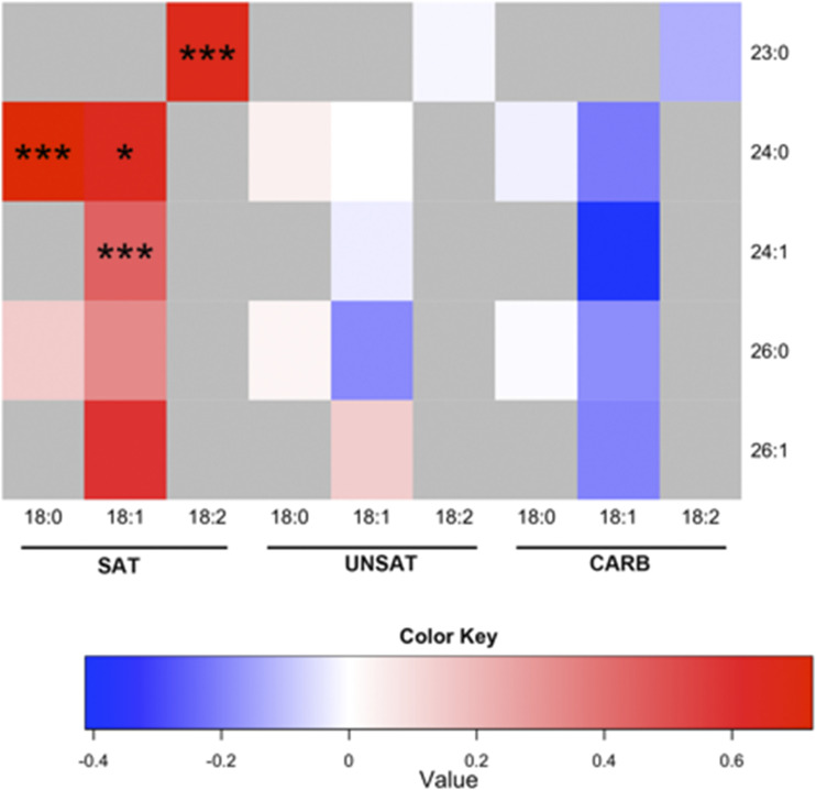
Figure 3.
Overfeeding-induced changes in individual plasma ceramides in the groups. Each square in the heat map indicates the log2 of the ratio between mean concentrations after vs. before for an individual ceramide. The color key denotes the relationship between the color of the heat map and log2 of the ratio between the means, with 0 indicating no change. The y-axis denotes the fatty acyl chain structure (number of carbon atoms:number of double bonds), and the x-axis indicates the sphingoid base species. *P < 0.05; ***P < 0.001.

