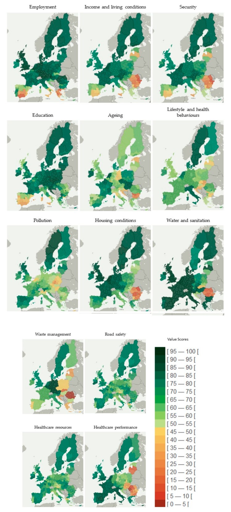
Figure 2.
Geographical distribution of the population health index at regional level and across dimensions of health determinants. Note: The regional value-scores are classified in an equal interval scheme. This method divides the values into equal size range considering the minimum and maximum scores (from 0 to 100). The color coding of classes uses a gradation inspired by a traffic light system; red represents worse population health and green represents better health.

