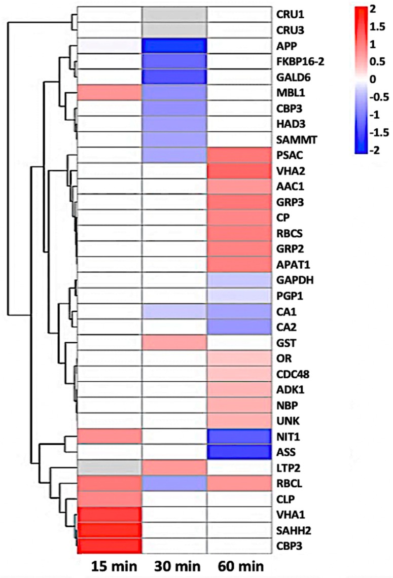
Figure 7.
Heat-map of 35 nitrosylated proteins obtained by hierarchical clustering. The columns represent different time point ratios of treatment/control. The rows represent individual proteins. Protein AGI numbers are listed to the right. The increased and decreased proteins are represented in red or green, respectively. The color intensity increases with increasing differences, as shown in the scale bar. Please refer to Table 1 for detailed information.

