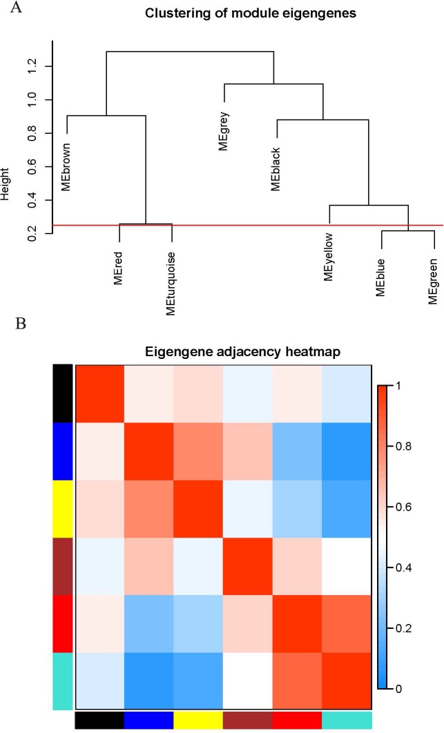
Figure 2. Connectivity analysis between different modules.
(A) Hierarchical cluster analysis of the genes in different modules; (B) connectivity level analysis of the genes in different modules. Within the heatmap, red represents a positive correlation and blue represents a negative correlation. Squares of red color along the diagonal are the meta-modules.

