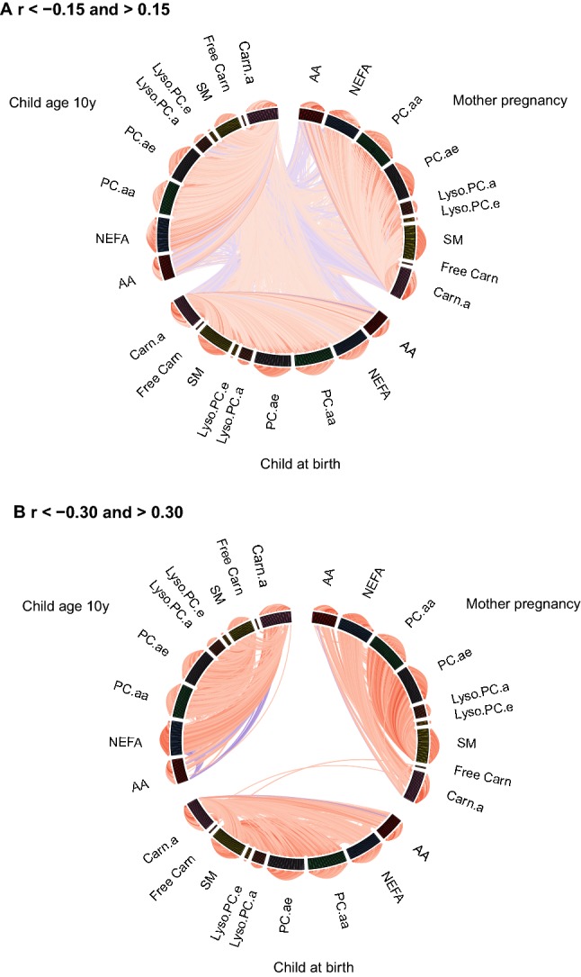
Fig. 2.

Circos plots of correlations between individual metabolite concentrations. Lines represent Pearson’s correlation coefficients between the individual metabolite concentrations within metabolite groups (outer circle), between metabolite groups (inner circle) and between time points (lines going through the middle of the circle). Red lines represent positive correlations and blue lines represent negative correlations. The brightness of the lines indicates the strength of the correlations, with brighter colors for stronger correlations. a Shows only correlation coefficients lower than − 0.15 and higher than 0.15 and b shows only correlation coefficients lower than − 0.30 and higher than 0.30. AA amino acids, NEFA non-esterified fatty acids, PC.aa diacyl-phosphatidylcholines, PC.ae acyl-alkyl-phosphatidylcholines, Lyso.PC.a acyl-lysophosphatidylcholines, Lyso.PC.e alkyl-lysophosphatidylcholines, SM sphingomyelines, Free Carn free carnitine, Carn.a acyl-carnitines
