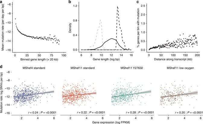
Fig. 5. Relationship between gene size, expression, and mutation.
a Dot plot showing the mutational load of genes in relation to their size. Mutated genes from all growth-condition groups were binned by size into 20 kb bins. Dots represent individual bins containing genes of increasing size; the y-axis indicates the mean number of mutations per base-pair for each bin (natural log scale). Mutational load decreased with increasing gene size. b Density plot showing the distribution in gene size for the 10% of genes with highest mutation load (dashed grey line) compared to an equal number of the least-mutated genes (dashed black line) and to all mutated genes (solid black line). Genes with a high mutational burden were small compared to the overall size distribution and were significantly smaller than genes with a low mutational burden. c Dot plots showing the percentage of mutated genes per subclone with occurrences of mutation at increasing distances from transcription start sites (TSS). The x-axis denotes distance from the TSS (kb); the y-axis shows the percentage of genes within each bin that harbour mutation. The data show increasing mutation prevalence with increased distance from TSS. d Scatter plots showing of the relationship between mutational load (y-axis) and gene expression (x-axis) in MShef4 and MShef11 under all conditions (natural log scale). Plots indicate a weak positive correlation between expression and mutation. Solid coloured lines indicate the fitted linear regression models for each group; shaded regions around regression lines indicate 95% confidence intervals for the models. Spearman correlation test statistics and P-values are shown for each group (MShef4 standard:.rho = 0.24; MShef11 standard: rho = 0.22; MShef11 + Y27632: rho = 0.28; MShef11 low oxygen: rho = 0.2). Source data are provided in Supplementary Data 4 and 5.

