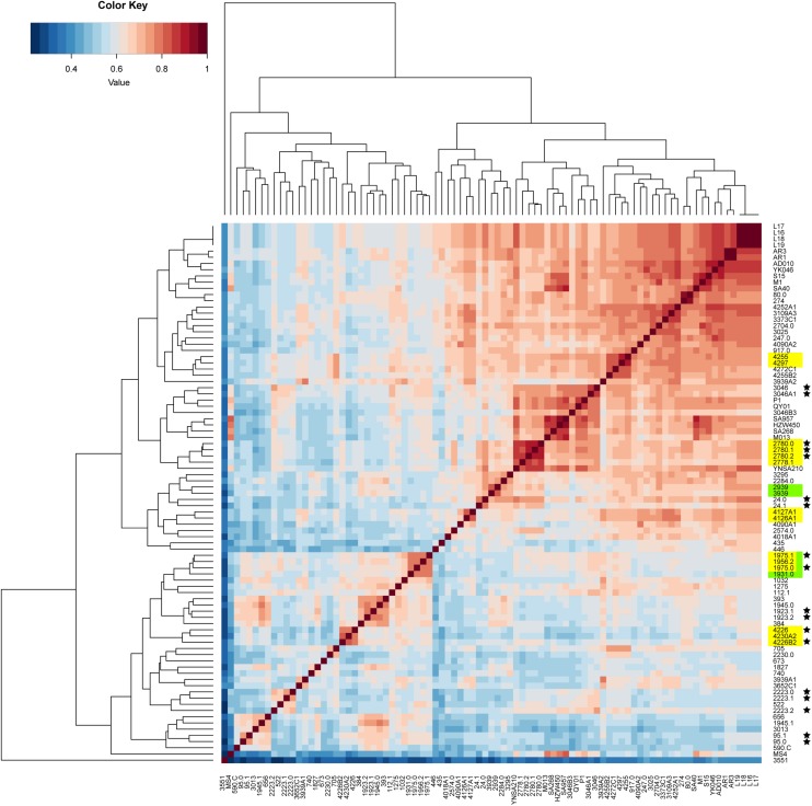
FIGURE 4.
Comparison on the accessory gene profiles among the isolates. The differences in accessory gene contents are presented by a heatmap of the gene content correlation matrix. The dendrograms across the top and side indicate the hierarchical clustering by gene content. Isolates that were source from the same food sample are marked up with colored stars. Isolates estimated to have been involved in recent local transmission are marked with yellow, and those estimated to have been involved in recent cross-country transmission are marked with green.

