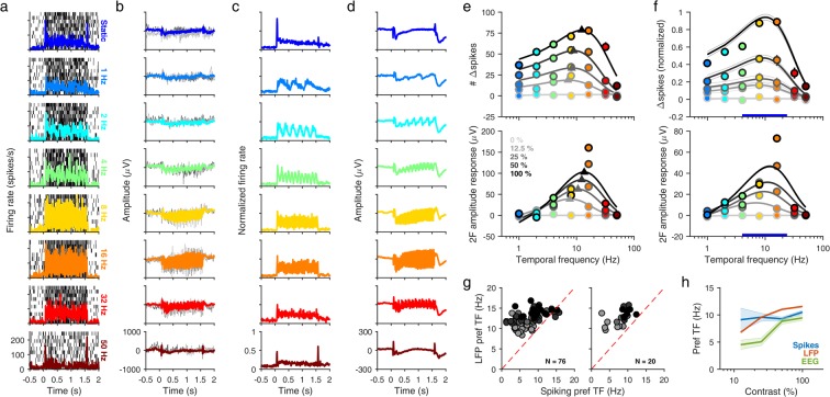
Figure 1.
SSVEP tuning of MUA, LFP and EEG. (a) Raster plots (thin black ticks) and peri-stimulus time histogram (PSTH, solid colored trace) plots of the MUA response of a typical electrode (Monkey 1, electrode 2) to a full-contrast 90° sinusoidal grating presented at a range of counterphase frequencies in Experiment 1. Rows show TF conditions from top to bottom: static, 1 Hz, 2 Hz, 4 Hz, 8 Hz, 16 Hz, 32 Hz and 50 Hz. (b) Evoked response (solid colored trace) for the same electrode and session. Two example trials (thin light and dark gray traces) are also plotted for comparison. (c) PSTH plots showing mean firing rate for the entire population of MUA electrodes (N = 32), normalized across sessions. MUA electrodes were selected from LFP electrodes having a SNR of ≥2, which had accumulated ≥2000 spikes during the recording, and showed a firing rate increase of ≥5 spikes/s (Monkey 1) or ≥3 spikes/s (Monkey 2) in the 0.5–1.5 sec period after stimulus onset for the full contrast, static grating. (d) Mean evoked response for the entire population of LFP electrodes (N = 650) across sessions. (e) Difference of exponentials fits for the spiking response (top) and LFP response (bottom) of example electrode shown in (a,b) respectively, for five contrasts (0, 12.5, 25, 50 and 100%). Fits (grayscale curves) were computed for mean change in spike counts and mean change in SSVEP amplitude at 2F (colored circles) as a function of TF for each contrast separately. Triangles denote the estimated preferred TF for each nonzero contrast. Error bars denote ±1 SEM and are smaller than marker size when not visible. Changes in spike counts and SSVEP amplitudes were computed during 0.5–1.5 sec after stimulus onset, using the 1 sec pre-stimulus period as baseline. (f) Difference of exponentials fits for the normalized MUA response (top) and LFP response (bottom) across the entire population of MUA (N = 32) and LFP (N = 650) electrodes respectively. Error bars/curves denote ±1 SEM. Thick blue bar indicates the combined TF range over which mask frequency was varied in Experiment 2. (g) Scatter plots of preferred TFs estimated for MUA (x-axis) and LFP (y-axis) responses from the same electrode. Each data point represents an electrode having fit quality ≥0.75 and preferred TF ≥ 1 Hz for both MUA and LFP responses for a contrast condition (gray level). Left panel, all electrodes meeting chosen criteria. Right panel, spiking electrodes above cutoffs chosen in (c). (h) Mean preferred TF as a function of increasing contrast, estimated from band-pass (preferred TF ≥ 1 Hz) difference of exponentials fits for MUA, LFP and EEG (N = 4) electrodes. Shaded error bars denote ±1 SEM.

