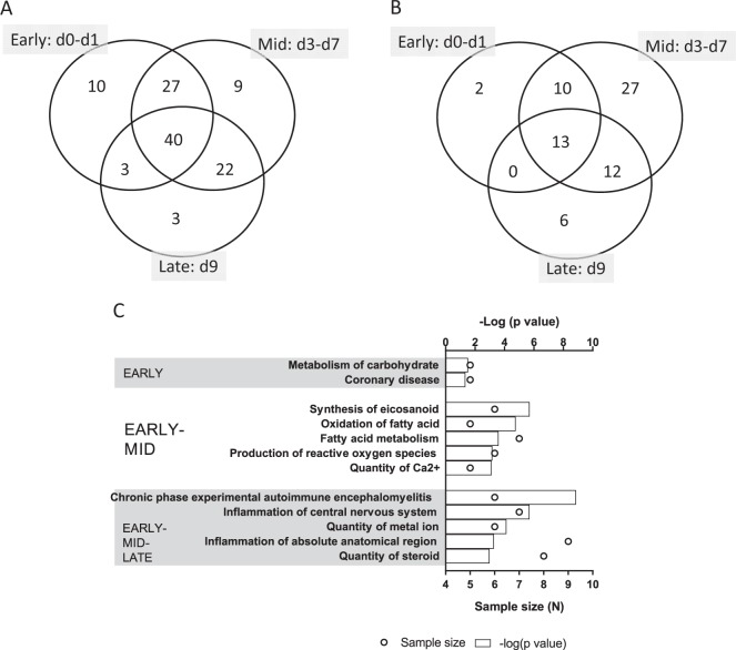
Figure 4.
The global metabolite profile responding to lethal radiation. (A) Venn diagram shows the longitudinal distribution of differentially expressed metabolites across three time phases post-TBI, namely, Early (d0–d1), Mid (d3–d7) and Late (d9). The largest number of differentially expressed metabolites (40 metabolites) is found at the cross section of the three phases. (B) Venn diagram shows the longitudinal distribution of significantly enriched networks across three time phases post-TBI, namely, Early (d0–d1), Mid (d3–d7) and Late (d9). Unlike the miRNA profile, here most of the networks are linked to the Mid phase post-TBI. (C) The top 5 most significantly enriched networks during the Early, Early-Mid and Early-Mid-Late phases are shown in this bar chart. The Early phase enlists only 2 networks, so all of them are included here. The top horizontal axis represents the −log(p value), and the bars represent the hypergeometric p-values converted to log10 associated with individual networks. The bottom horizontal axis represents the sample size (N), and the open circles represent the number of metabolites associated with individual networks.

