
Figure 2. Normalized difference vegetation index data (NVDI) Fourier images of Europe.
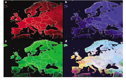
a | The mean is shown in red. b | The annual amplitude is shown in blue. c | The annual phase (that is, the timing of the annual peak) is shown in green. d | All three signals are shown together, which shows how this method of analysis captures habitat seasonality across Europe (notice, for example, that the mean is generally higher in western Europe, with the exception of many parts of Spain, but the annual amplitude is higher in eastern Europe). The white arrow in the mean image points to the site from which the data for Fig. 1 were obtained.