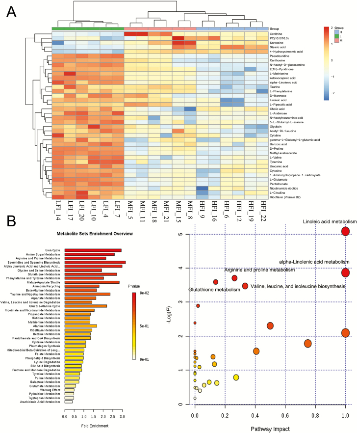
Figure 4.
Hierarchical clustering analysis for identified differential metabolites in the LFI group (n = 6), MFI group (n = 6), and HFI (n = 6) (A). Green squares represent LFI group, pink squares represent MFI group, and blue squares represent HFI group. Each row represents one metabolite; each column represents one sample. Cells are colored based on the signal intensity measured from LC-MS. Dark brown represents high ruminal levels, blue shows low signal intensity, and gray cells show the intermediate level (see color scale on the right of heat map). Analysis of metabolism pathways as visualized using a bubble plot, through MetPA software (B). The bubble size is proportional to the impact of each pathway and the bubble color presents the significance, from highest in red to lowest in white; P-value is less than 0.05 and pathway impact factor is more than 0.5 indicate that the pathway is greatly influenced.

