
FIG. 5.
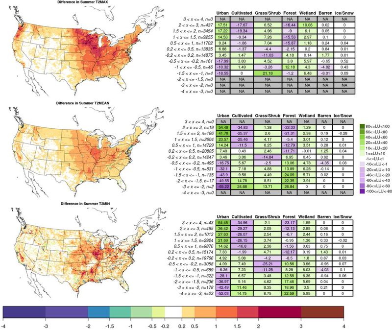
Differences (mosLU minus domLU) in daily maximum, mean, and minimum 2-m temperature plotted within the CONUS and averaged over the summer months for the simulated 3-year period (left: top, middle, and bottom, respectively). Corresponding tables (right) show the LU change (mosLU minus domLU) in each of the consolidated categories, as spatially-averaged over areas that lie within each of the temperature intervals as plotted on the left. Boxes are filled with darker colors as the absolute value of the LU change increases; see legend on the right. Temperature bins are listed on the left of each table, along with the number of grid cells averaged.