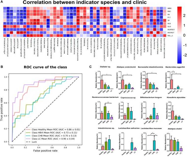
FIGURE 5.
The indicator species’ distribution and correlation with clinics along with the disease progression. (A) The correlation graph between clinics and indicator species, * denotes significance p < 0.05 and ** denotes p < 0.01. (B) The ROC curve based on the indicator OTU to predict its potential to distinguish healthy and non-healthy, HBVI and non-HBVI, CHB and non-CHB, LC and non-LC. (C) The distribution of those indicator species with higher abundance (>0.1%) that significantly correlated with clinics. * Denotes significance p < 0.05 and ** denotes p < 0.01. The color scheme for Healthy, HBVI, CHB and LC in the graph are red, green, blue, and purple.

