Fig. 2.

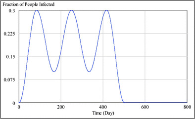
Waves of worker absenteeism assumed in the model. The graph illustrates how absenteeism during a single simulation run of a pandemic would cycle between 10 and 30 %. Peak absenteeism might be different in other simulation runs

Waves of worker absenteeism assumed in the model. The graph illustrates how absenteeism during a single simulation run of a pandemic would cycle between 10 and 30 %. Peak absenteeism might be different in other simulation runs