
Fig. 4.
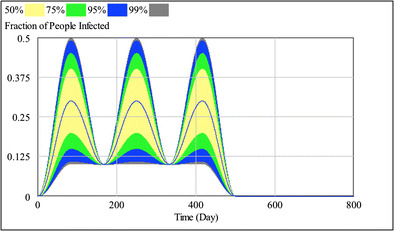
Waves of worker absenteeism responsible for food deficits in the simulation runs. Each run was based on a cycle with a trough of 10 % absenteeism and a peak selected randomly from a range of 10 to 50 % absenteeism. The blue line represents the absenteeism in a median cycle, which varies from a trough of 10 % to a peak of 30 %. The colors represent the distribution of the absenteeism cycles in the 2,000 simulation runs. The color coding for distribution percentages is at the top of the figure