
Fig. 6.
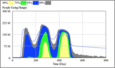
Number of hunger-days each day (in a population of 300 million people) over the course of the simulated pandemic. The colors represent the distribution of the results in the 2,000 simulation runs. The color coding for distribution percentages is at the top of the figure