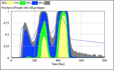
Fig. 8.

The fraction of individuals who do not have an adequate amount of food, shown over the course of the pandemic. The colors represent the distribution of the results in the 2,000 simulation runs. The color coding for distribution percentages is at the top of the figure. A very large number of individuals are hungry by the third wave in the pandemic
